Reflection SF / Jewish Federation of the Greater East Bay Rebrand
Jewish Federation of the Greater East Bay serves as the Center for Jewish Philanthropy in the San Francisco Bay Area. Its core purpose is to strengthen and foster thriving Jewish communities in the Bay Area, Israel, and around the world by inspiring and empowering philanthropists to make meaningful impacts guided by Jewish values. The Federation provides grants and programs focused on building Jewish identity and community for families and young adults. They also offer social services and care for those in need.
We were engaged to develop a distinctive brand voice and redesign both the annual donor brochure and the organization's website.
As Lead Designer, I began by conducting in-depth interviews with key stakeholders and immersing myself in research on Jewish values, religious practices, and the Federation’s current role within the community—as well as its ambitious vision for the future.


Case Study / 001
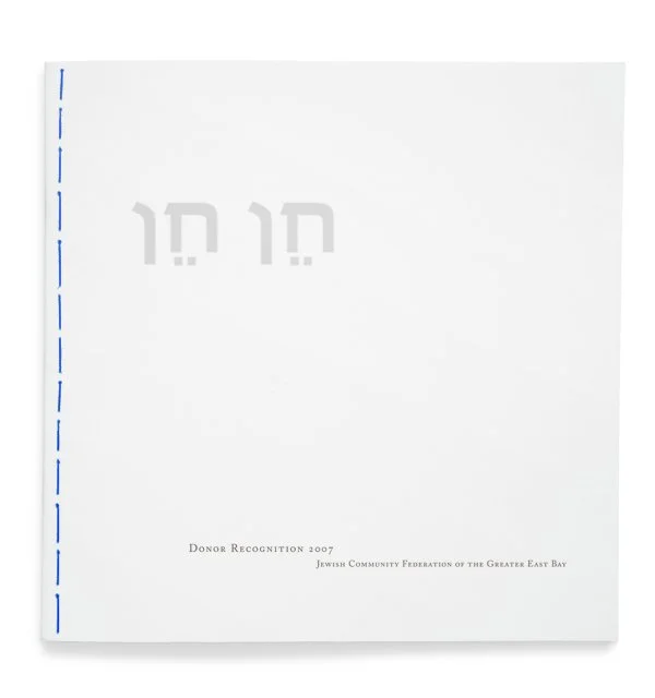
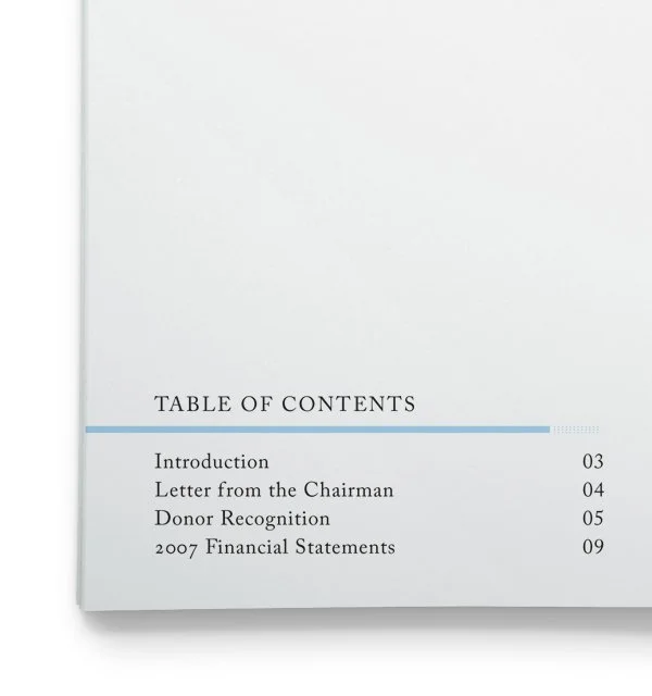
Annual Donor Brochure
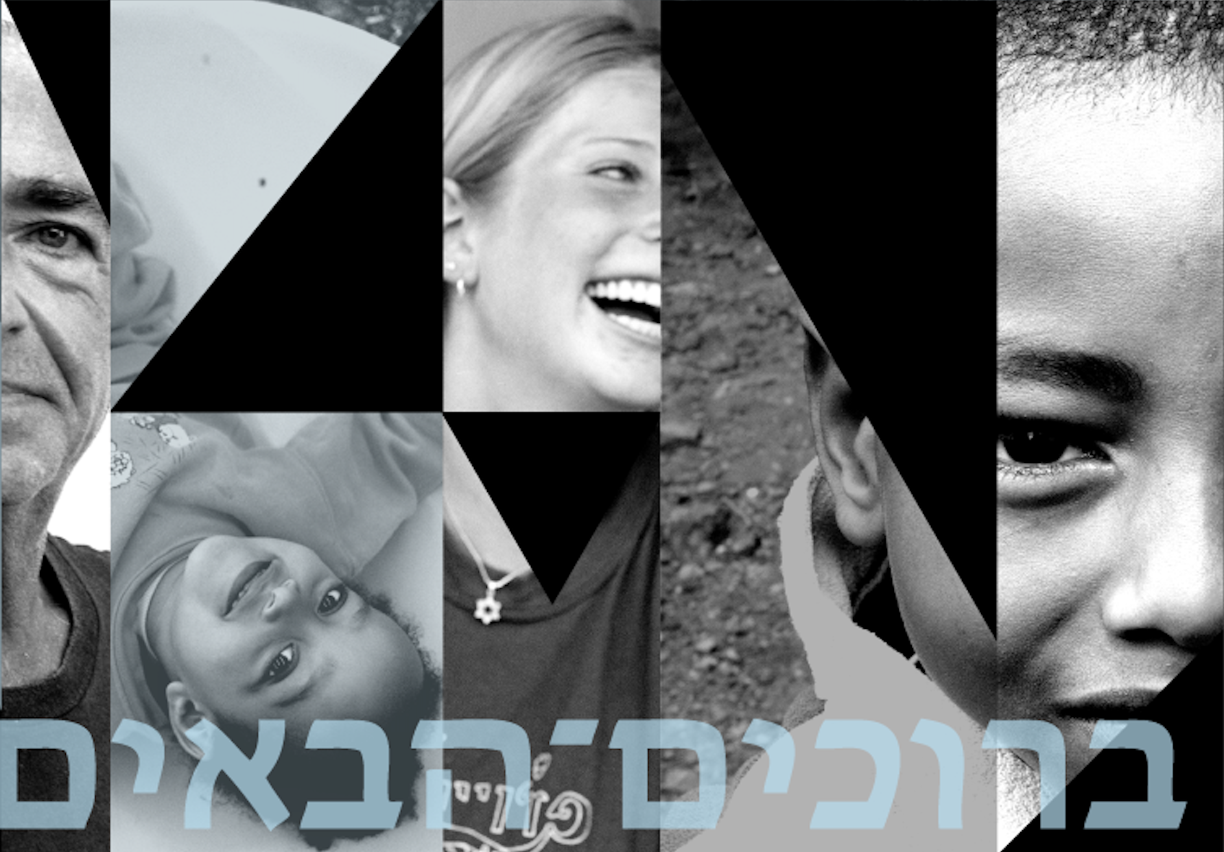
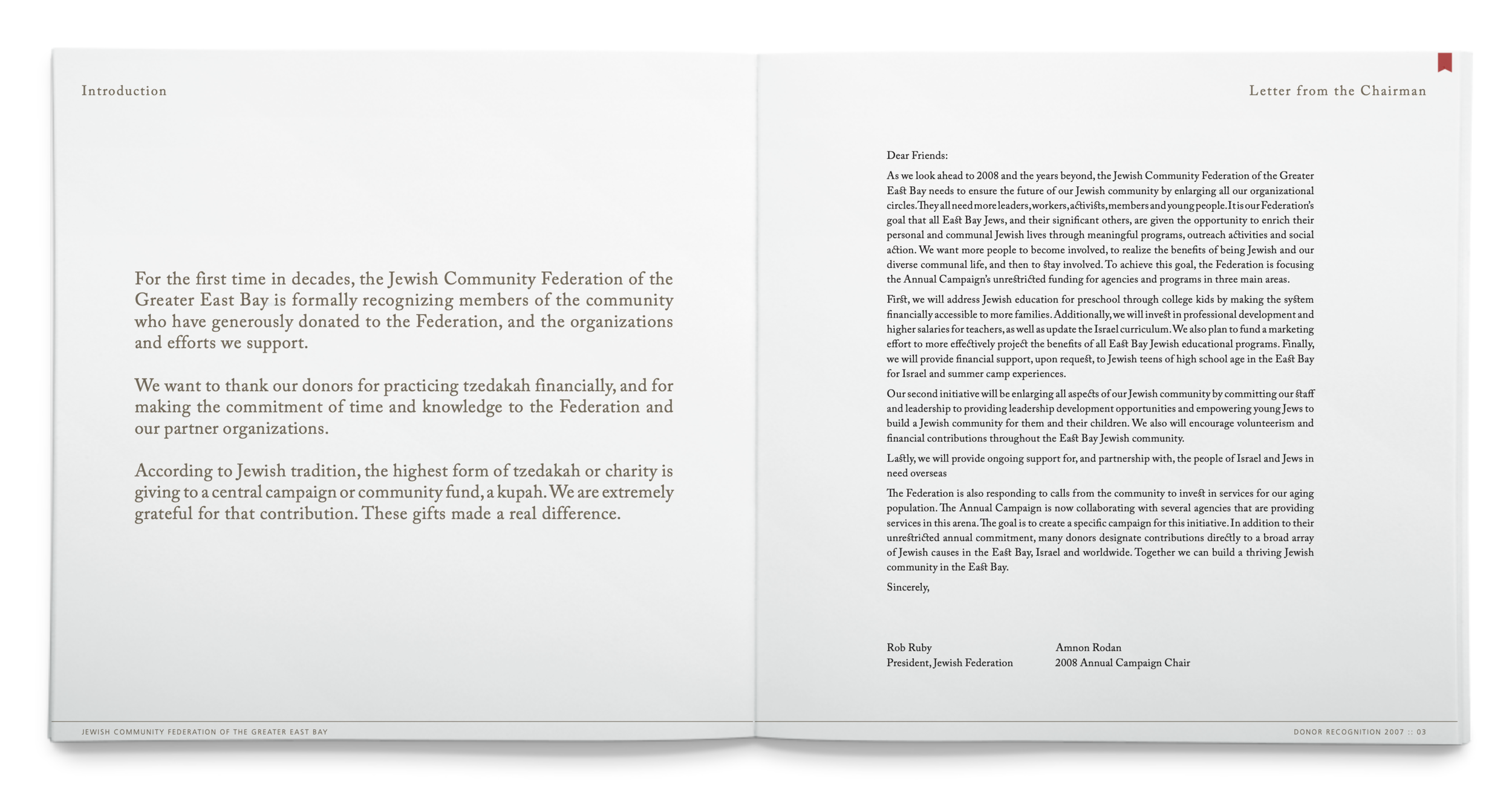
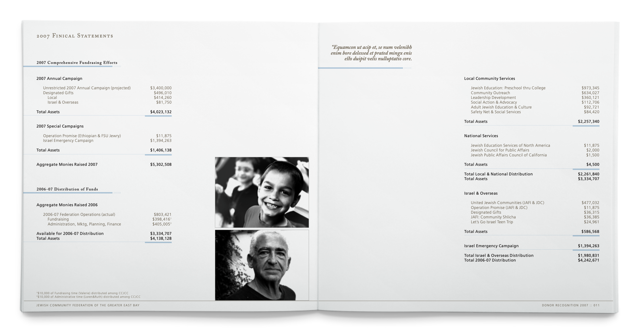
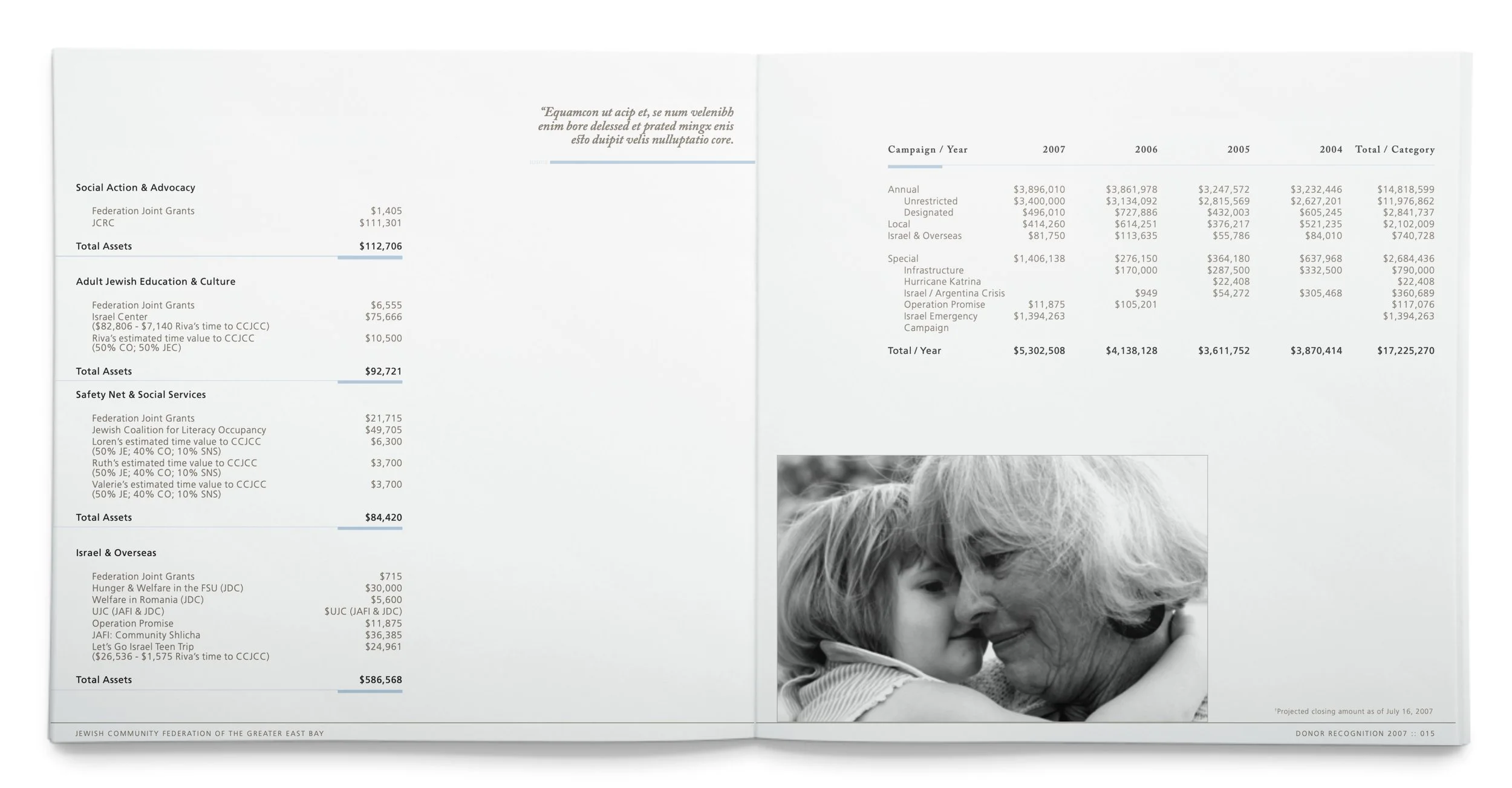
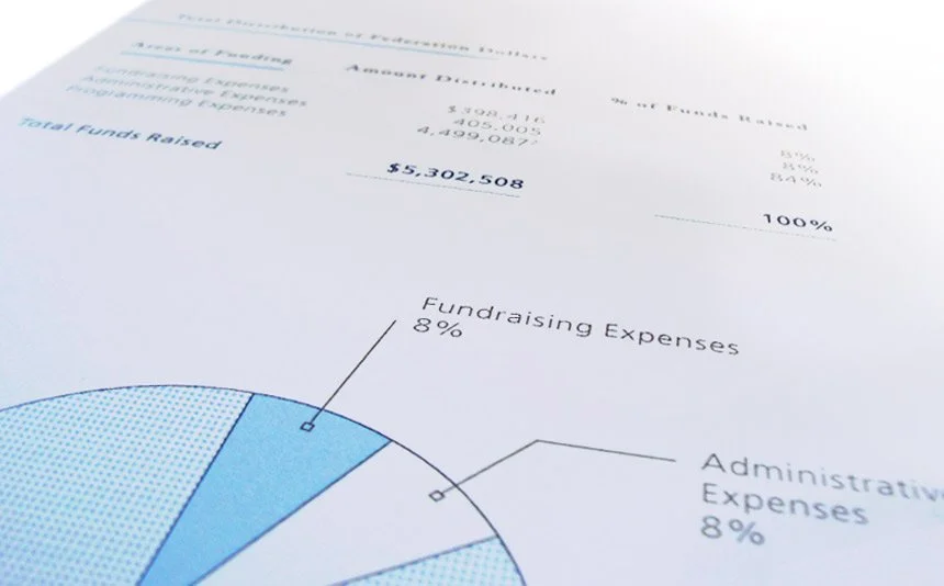
For the Jewish Federation of the Greater East Bay’s annual donor brochure, I sought to move beyond dry statistics and charts, transforming it into a vehicle for powerful storytelling—highlighting real community members and the profound, lasting impact their generosity has on families in need.
To capture the organization’s warmth, humanity, and quiet strength, I embraced generous white space throughout the layout. This intentional breathing room draws the reader’s eye to evocative, slightly overexposed black-and-white photographs that radiate authentic energy and emotion from the people at the heart of the Federation’s work.
Drawing inspiration from Jewish tradition, I selected the sacred sky-blue (tekhelet) as the primary accent color—symbolizing divine protection, spiritual elevation, and remembrance of God—paired with a soft, warm gray as the secondary tone. Together, these colors create a serene, contemplative palette that guides the eye gently back to the photographs and stories.
Even the physical binding echoes this symbolism: a subtle blue thread runs through the spine, evoking the tekhelet thread of the tzitzit—a quiet reminder of connection to tradition, purpose, and the divine.
The result is a brochure that feels less like a report and more like an invitation—to reflect, connect, and be inspired to give.
Case Study / 002
Website
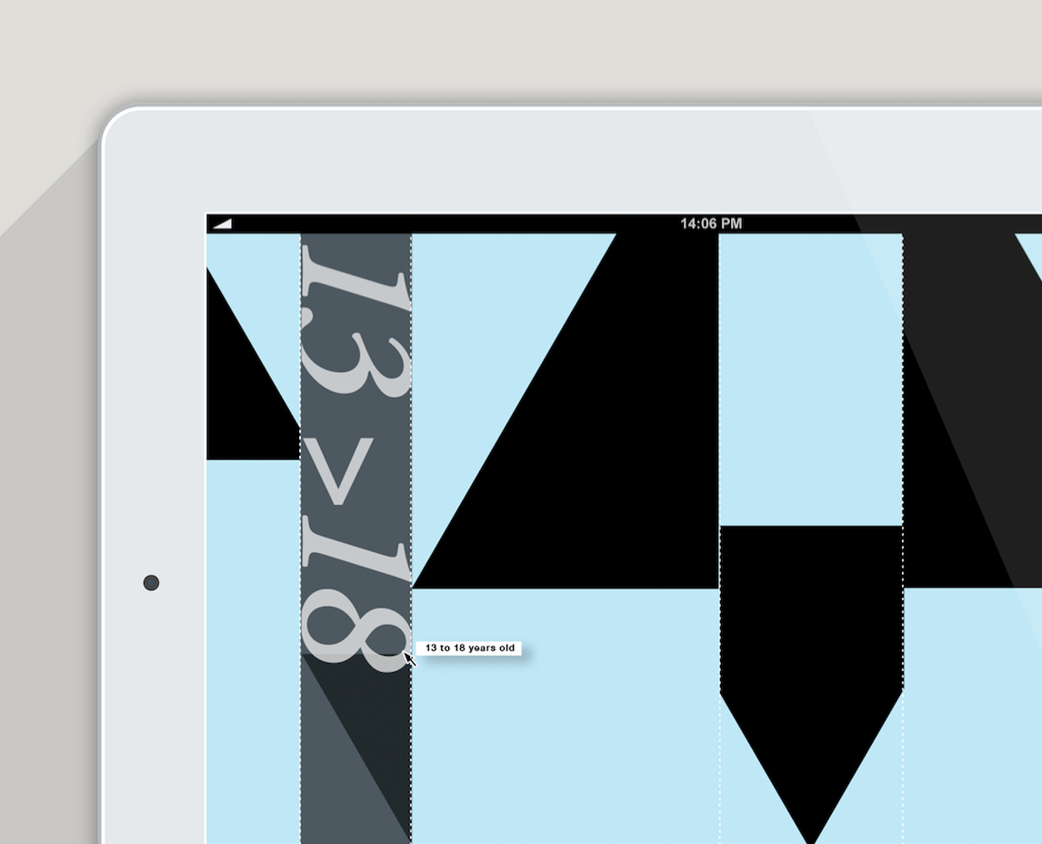
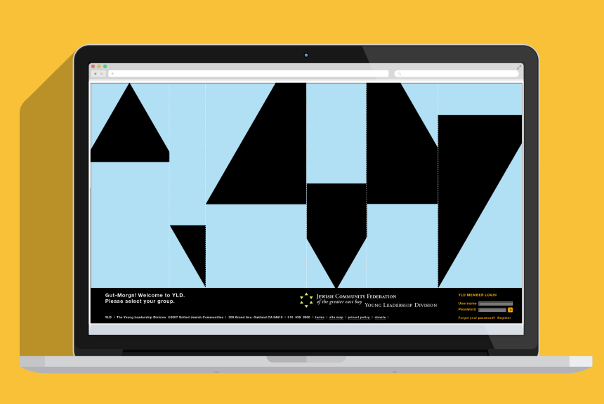
For the Jewish Federation of the Greater East Bay website, I had conversations with stakeholders and community members and understood their user needs. What emerged was a clear desire for better-targeted, relevant content; a stronger emphasis on engaging Jewish younger demographics; and a distinctive, symbolic visual identity that would instantly resonate with and represent their community's religious beliefs.
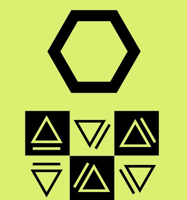
To address these goals, I reimagined the site’s primary entry points by age groups. I deconstructed the Star of David into a modular triangle pattern that connects the six key life-stage segments. This approach allows visitors to quickly find the content and programs most relevant to their own journey, whether they’re young families, teens, young professionals, empty-nesters, or seniors. By starting with a group they personally identify with, users feel seen and invited in—sparking curiosity to explore further, discover shared stories, and connect more deeply with others who reflect similar experiences and aspirations.