CDK Global / Consumer Vehicle Product Experience
CDK Global is the global industry leader in car buying backend and frontend software. Following its merger with Roadster, I served as the consumer experience UX lead in 2020 - 2024. Together, we transformed the car-buying journey by making the digital retailing experience accessible to dealerships of all sizes, enhancing convenience, efficiency, and customer satisfaction across the automotive retail landscape
I collaborated closely with product managers, engineers, researchers, and analysts. Using a data-driven approach, we continuously validated our assumptions through data and customer feedback. The greater challenge lay in unifying direction across departments while navigating the varying regulations across cities, states, and countries.

Case Study / 001
Vehicle Product Page
Through user testing and dealer feedback, the Vehicle Detail Page requires many UX and UI improvements, such as:
Modernize the look and experience to earn the trust and confidence of consumers.
🧔🏻♂️ / user testing: “The excessive white in the website makes it look like a fake scam website.”Reorganize contents and enhance conciseness through discoverable data. The challenge is to find the right balance in giving clear, simple information to consumers while meeting the legal rules and keeping dealers satisfied.
📊 / analytic: 50% does not scroll past 1/4 of the page, and 75% drop off at 1/2 of the page.
🧔🏻♂️ / user testing: 2/5 users never scrolled past the fold. 2/5 users felt overwhelmed by the long content. 1/5 user suggested balancing the right/left content.

Case Study / 002
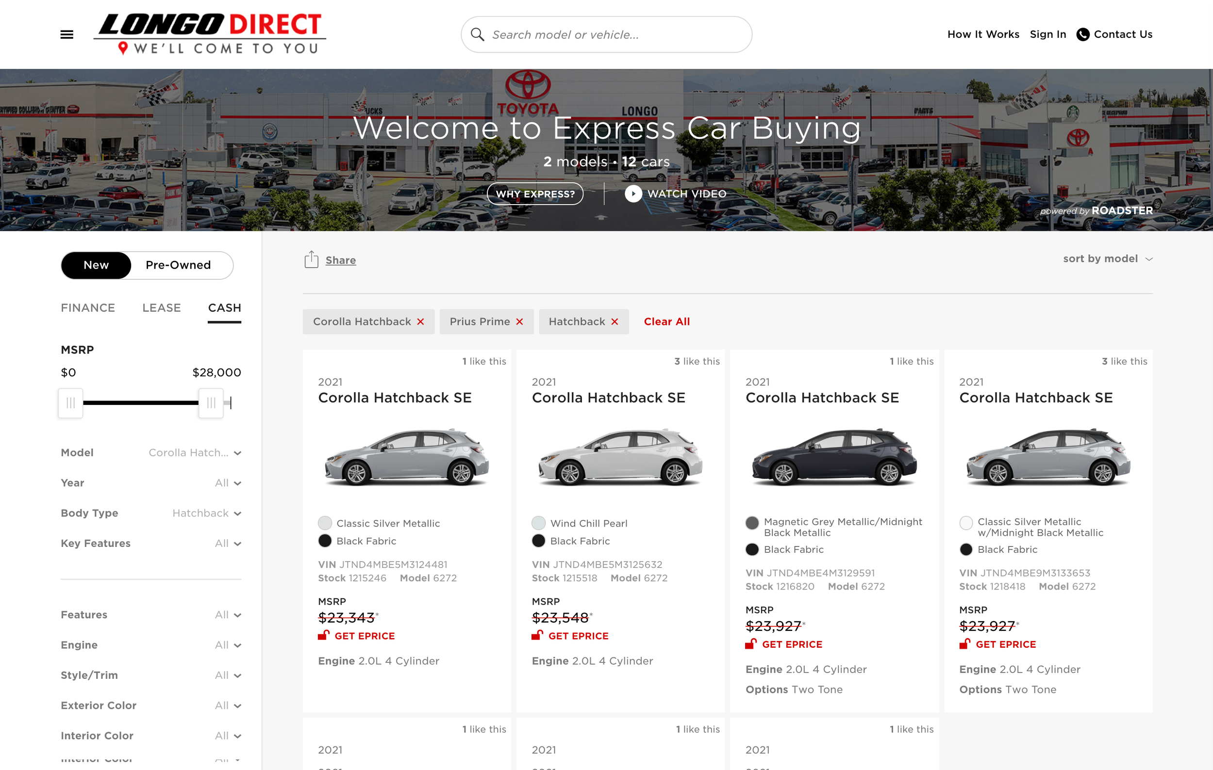
Search Result Page
To improve the low engagement and conversion rate, the SRP/Search Result page needs updates in interface and content design to improve usability and fluidity.
📊 / analytic: Among the 1,300 consumers who visited the dealership homepage. Half needed to enter personal information to see the price due to state rules and dealer preference. Only 10% proceeded by sharing their information. Also, only 455 out of 1,300 proceeded to the next page.
Focus on two main areas to improve the SRP:
Combine the scattered and segmented functions and information into a single layout to lessen eye movement and better mobile experience.
Enhance product filtering (filter, sort, compare) and vehicle cards, making them more functional, more intriguing, and easier to use.
Case Study / 003
Image Gallery
User testing and data analysis show that the Vehicle Detail Page image gallery has the biggest missed opportunity but an directive solution.
📊 / analytic: Images get the most attention on the Vehicle Detail Page, with about a 40% engagement rate. On average, users click 10 to 13 photos each session.
However, about 60% of new vehicles show only 3 or fewer stock images.
To fix the problem, we updated the UX, UI, and backend coding and made the component mobile-friendly. We also connected several departments—legal, stock image management, and data—to follow international laws and OEM brand rules. We tested user image preferences and three design options: Category (show below), Thumbnails, and Highlights. This project was a true team effort involving design, product, engineering, and analytics, with everyone's expertise valued in the final result. One of my proudest works.