Logo Branding Works / Microsoft, Molbak’s, Optimal Equine & More.
When it comes to crafting brand identities and logos, I take particular pride in having honed my skills the “old-school” way—through rigorous training at California College of the Arts and hands-on internships alongside some of the most talented designers at Hornall Anderson in Seattle.
My process always begins with deep immersion: studying the brand’s heritage and story, analyzing competitors’ visual identities, exploring color narratives, and staying attuned to emerging trends. From there, ideas take shape through countless sketches, iterative explorations, trial and error, and close collaboration with clients.
Only then comes the meticulous digital refinement—hours and days spent in Illustrator sculpting forms, balancing proportions, and ensuring versatility across every possible application: from tiny favicons to massive billboards, light and dark backgrounds, monochrome adaptations, and, most importantly, the test of time.
A truly great brand identity is far more than a vector icon. It’s a visual emblem that evokes emotion, sparks recognition, and embeds itself in memory.
Below are some of the logos I’ve had the privilege to create over the years.

Case Study 001
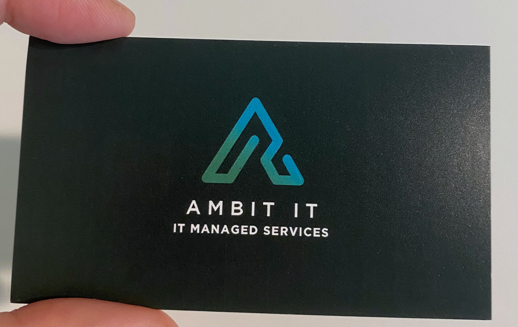
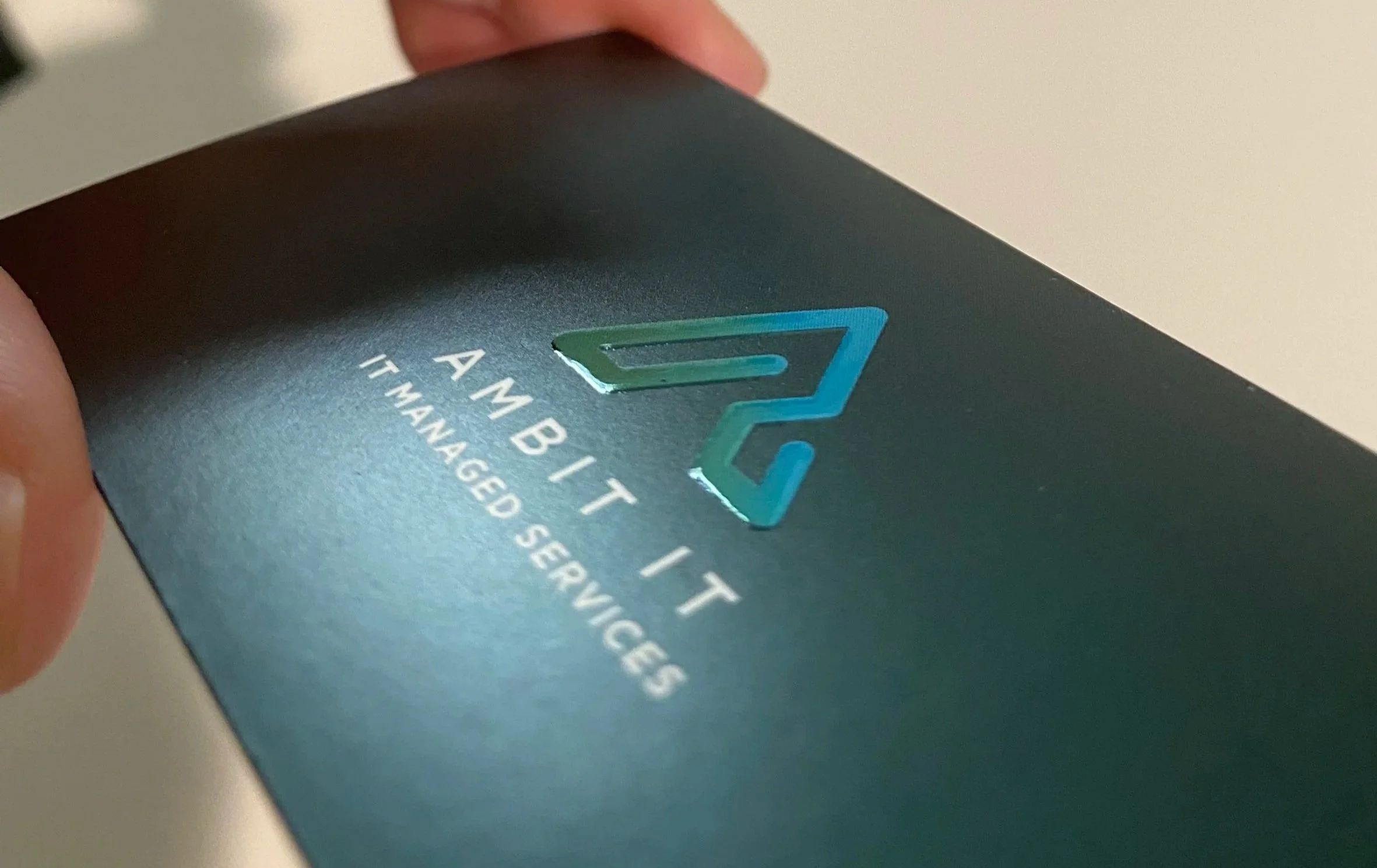
Ambit IT
Ambit IT is an Austin-based managed IT services provider that has proudly supported small businesses for over 20 years. Founded and led by a U.S. Navy veteran, the company embodies the same discipline, loyalty, and unwavering commitment that defined his military service—values now extended to every client relationship.
To reflect this heritage, I designed the brand identity around a deep green theme, evoking the strength, authority, and quiet confidence associated with military tradition while maintaining a modern, professional edge.
The logo features a high-gloss embossed treatment, creating a subtle yet striking tactile dimension when printed. This premium finish not only adds a distinctive physical texture, but also symbolizes the cutting-edge, high-tech expertise that Ambit IT delivers—making the brand feel as polished and reliable as the service it represents.
Case Study 002
Annie Bioko
Annie Bioko founded her eponymous stationery brand alongside her mother, crafting heritage-inspired, hand-made organic paper goods that evoke a profound sense of warmth and tactile intimacy. Each piece is designed to carry the writer’s deepest emotions—transforming everyday notes into heartfelt connections with loved ones.
Throughout the design process, I had the privilege of witnessing the extraordinary bond between Annie and her mother—a relationship woven with love, tradition, and quiet strength. Inspired by this, I sought to reflect their intertwined connection through a custom calligraphy-inspired pattern and typography that feels intimately personal, as if penned by hand.
The flowing, organic letterforms and subtle interwoven motifs capture the essence of handwriting—not just as a style, but as an emotional imprint—echoing the tenderness and legacy that define both the brand and the family behind it.

Case Study 003
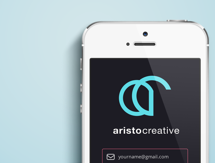
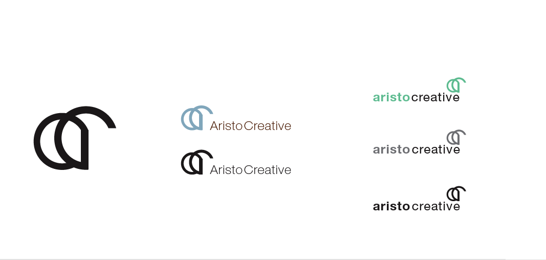
Aristo
Aristo is a multidisciplinary company with branches in Creative, Digital, and Marketing. I developed a design approach centered on clean, geometric shapes—timeless and instantly recognizable forms that could flexibly represent both the parent brand and its individual branches. Combine the foundational “A” of Aristoshape with modular variations that emerge for each branch. This system delivers a cohesive brand presence that scales effortlessly across applications, reinforcing Aristo’s integrated yet specialized expertise.
Case Study 004
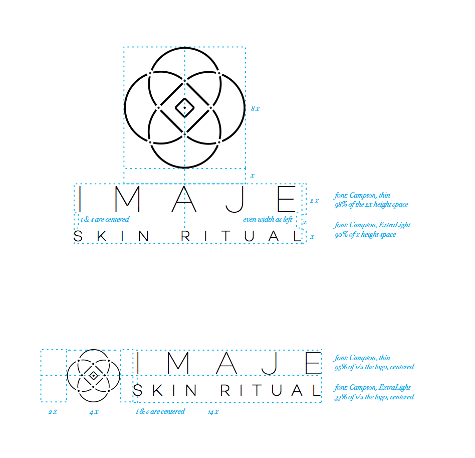
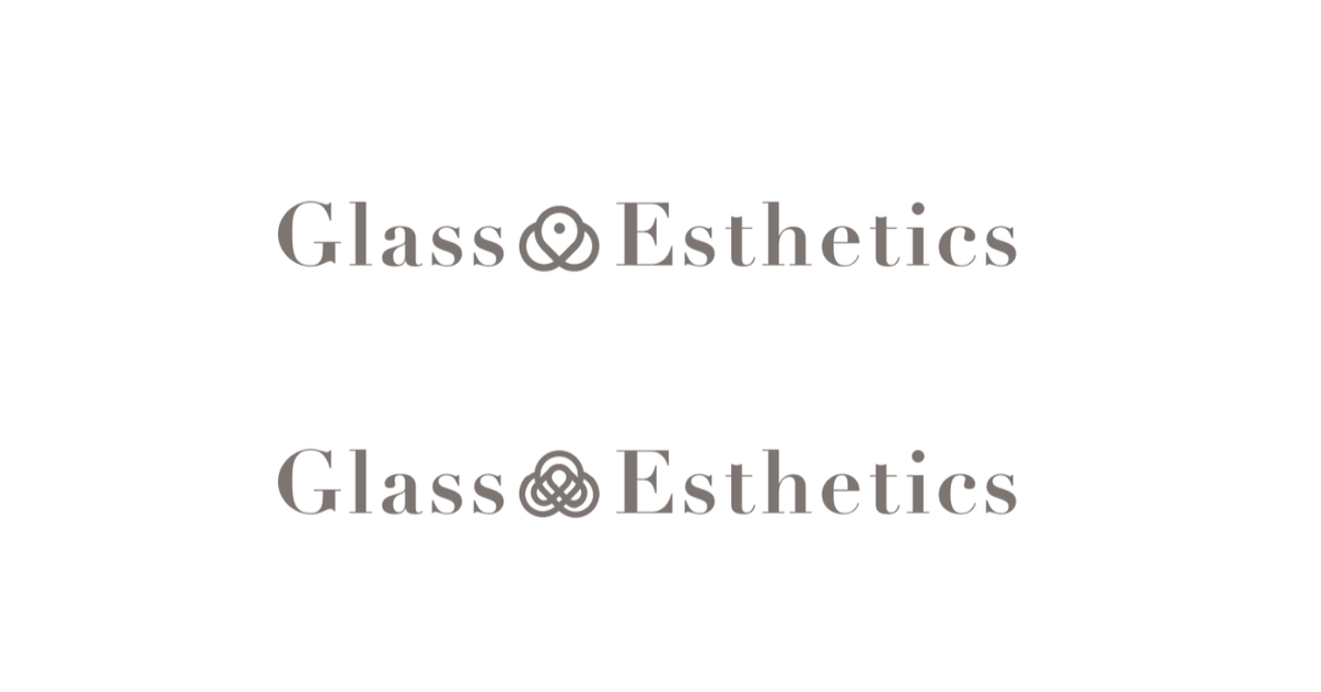
Imaje Skin Ritual
Imaje Skin Ritual (formerly Glass Esthetics) is a woman-owned skincare studio dedicated to clean, innovative Korean beauty practices and products.
The heart of the brand lies in the personal story of its founder, Jamie Hiyama—a second-generation Japanese-Korean American. Growing up, Jamie watched her mother treat skincare as a quiet, almost sacred ritual: deliberate, unhurried, and rooted in simplicity. Consistent, gentle daily steps passed down through generations, using pure natural ingredients to nurture and reveal one’s authentic inner glow.
This sense of heritage and restraint deeply informed the brand identity I designed. To honor Jamie’s childhood memories, I drew inspiration from traditional Korean ornamental knots (maedeup), which she used to craft alongside her mother. The resulting emblem—a fluid, interconnected knot motif—also subtly nods to her father’s Japanese family crest, weaving together both sides of her cultural lineage into a single, elegant symbol of continuity, balance, and quiet strength.
The visual language reflects the same philosophy: minimal, refined, and timeless—inviting clients to embrace skincare not as a trend, but as a meaningful ritual that celebrates natural beauty and generational wisdom.
Case Study 005
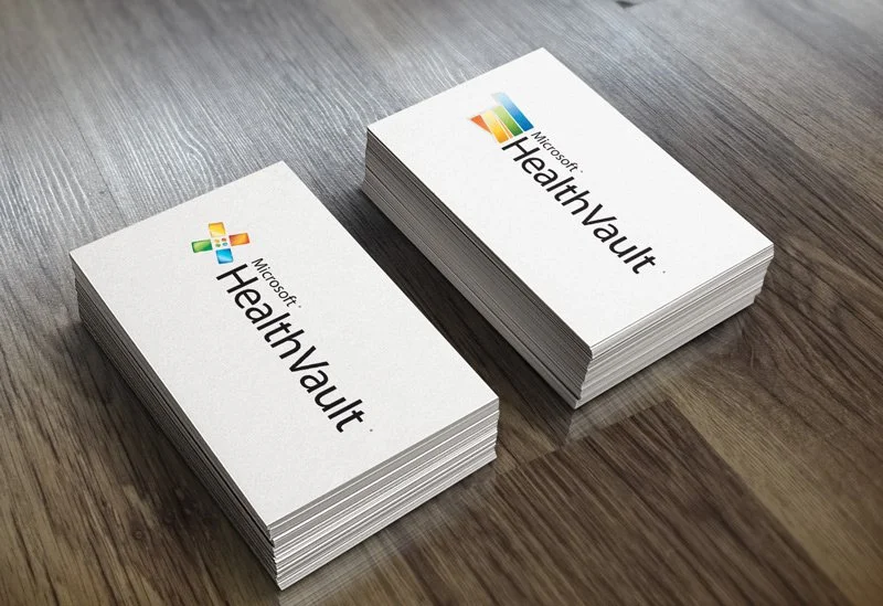
Microsoft HealthVault
Microsoft HealthVault was a secure digital health platform designed to empower consumers, physicians, and healthcare professionals with trusted tools for managing personal health records and medical information.
The core design challenge was to craft a logo that felt instantly recognizable as part of the Microsoft family while strictly adhering to the company’s brand guidelines for typography, color, and visual style.
To achieve this, I incorporated the most universally understood symbol in healthcare—the bandage—reimagined in a clean, modern geometric form. The iconic crossed shape of the bandage was subtly integrated into the mark, evoking care, healing, and trust without feeling overly literal or clinical.


Case Study 006
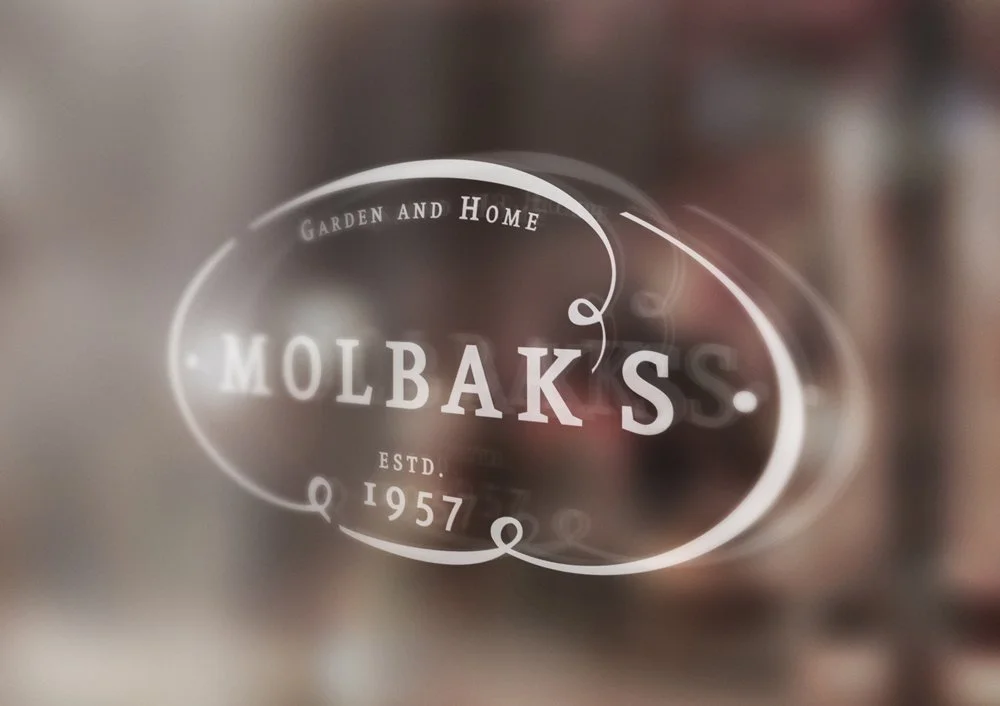
Molbak’s Garden and Home
Founded in 1957 by Danish immigrants Egon and Laina Molbak, Molbak’s Garden and Home grew into a cherished family-owned independent garden center and home décor destination in Woodinville, Washington—a Pacific Northwest institution beloved for its lush plants, inspiring displays, and deep connection to nature.
For the brand’s visual identity, I set out to design a logo that feels effortlessly organic and elegantly timeless—evoking the graceful forms, flowing lines, and quiet vitality of living plants and natural organisms.
The resulting mark draws subtle inspiration from botanical elements: soft, curving stems, unfolding leaves, and rhythmic growth patterns—honoring the Molbaks’ heritage while feeling fresh and endearing.
Case Study 007
Optimal Equine
Optimal Equine is a dedicated equine therapy service specializing in professional massage and holistic treatments to elevate horses’ health, performance, and overall well-being.
For the brand identity, I explored a range of illustration styles and typographic layouts to capture the essence of strength, grace, and therapeutic care.
The first direction features fluid, geometric forms—clean, abstract shapes that evoke movement and balance, resulting in a versatile, modern symbol that functions beautifully as both a standalone mark and a full logo.
The second draws inspiration from classical Roman motifs: elegant trophy-like elements that convey prestige, achievement, and timeless excellence—perfectly aligning with the pursuit of peak equine performance.
The third takes a more representational approach, emphasizing the horse’s natural grace, fluidity, and noble presence—bringing an emotional, lifelike warmth to the identity.


Case Study 008
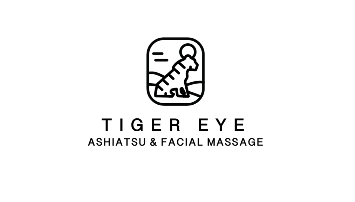
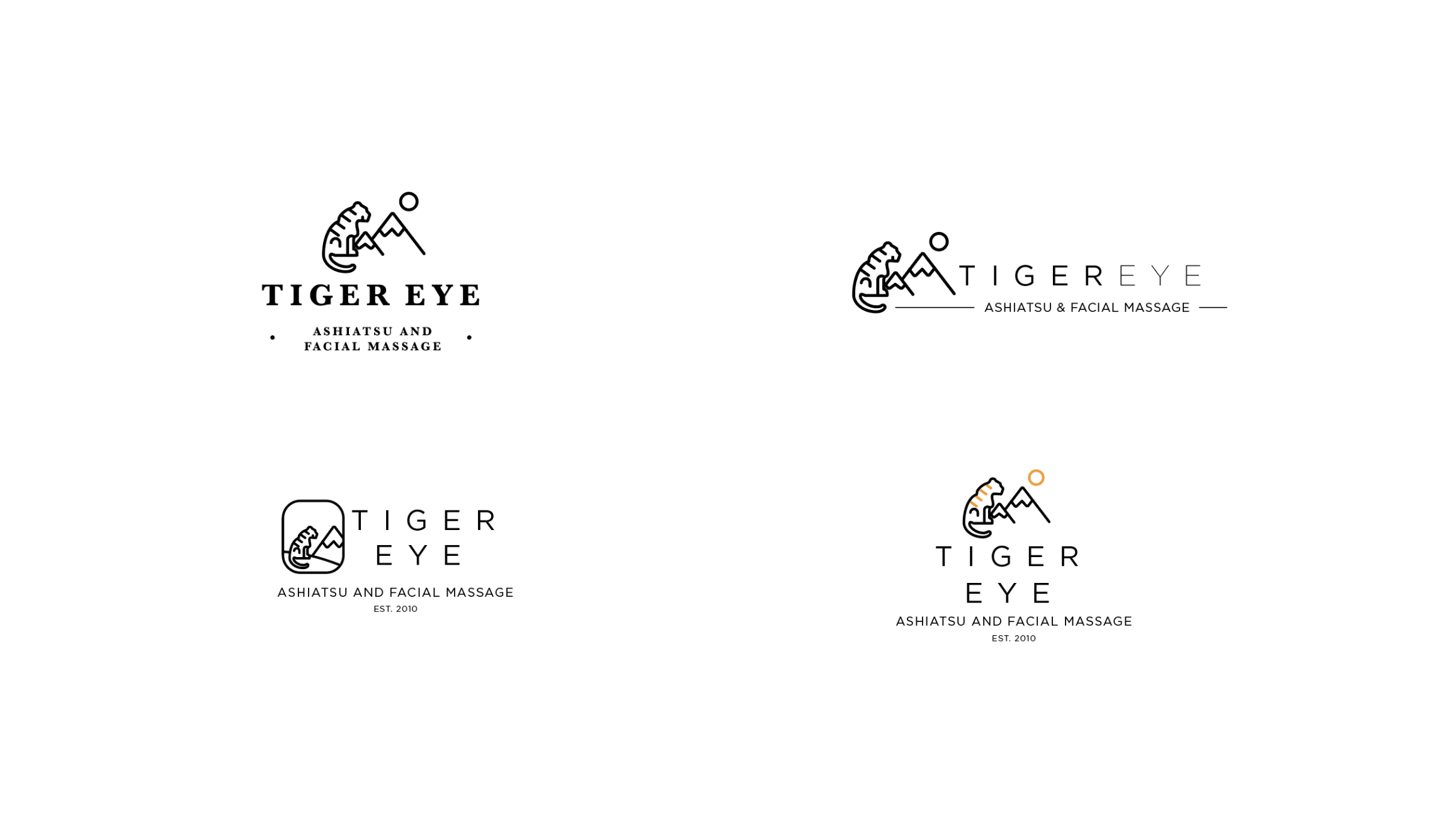
Tiger Eye Ashiatsu & Facial Massage
Tiger Eye Ashiatsu & Facial Massage is a woman-owned holistic wellness studio dedicated to nurturing full-body care through mindful, therapeutic touch.
The owner envisioned a logo that would be instantly recognizable, versatile, and timeless—something strong enough to carry the brand seamlessly into future retail ventures, from product lines to packaging.
Drawing deeply from her personal story, the design is inspired by a profound spiritual experience atop a snow-covered mountain in Switzerland. There, amid the vast silence, she encountered a vision of a majestic white tiger—a powerful symbol that perfectly aligned with her inner spirit, life purpose, and sense of quiet strength.
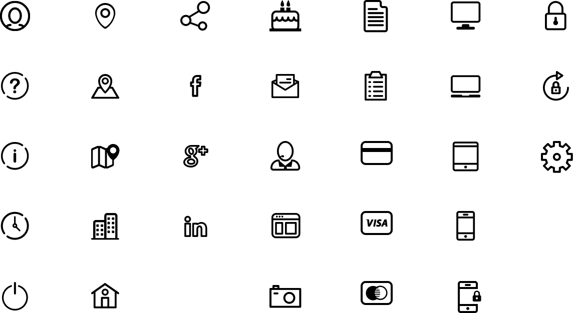
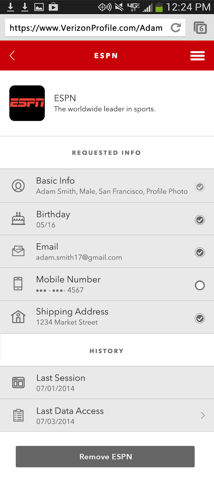
Case Study 009
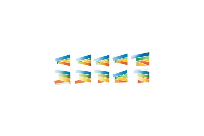
Verizon Universal ID
Icon set for the Verizon Universal ID project.