CCAC, Hornall Anderson, Celery Design / Healthy Home Workbook, Illusion, Space Needle & More
Designing a book is truly a labor of love. It begins with choosing the perfect paper—one that delivers just the right weight and texture, then comes sifting through thousands of fonts to find the one that matches the era, mood, and style of the story perfectly. Next, crafting or selecting artwork that breathes life into the narrative, making scenes vivid without overpowering the words. Sometimes, the artwork tells a second story subconsciously. Finally, the meticulous work of proofreading and fine-tuning: every single letter, kerning, leading, spacing, and alignment adjusted until nothing distracts or jars.
All this invisible craftsmanship rarely gets acknowledged. As the saying goes: good design is invisible. It serves the story so seamlessly that the reader glides through the pages immersed in the words alone, never once thinking about the typography, margins, or paper stock that made it all feel effortless and right. That's the quiet magic book designers chase.

Book 001 / CCAC
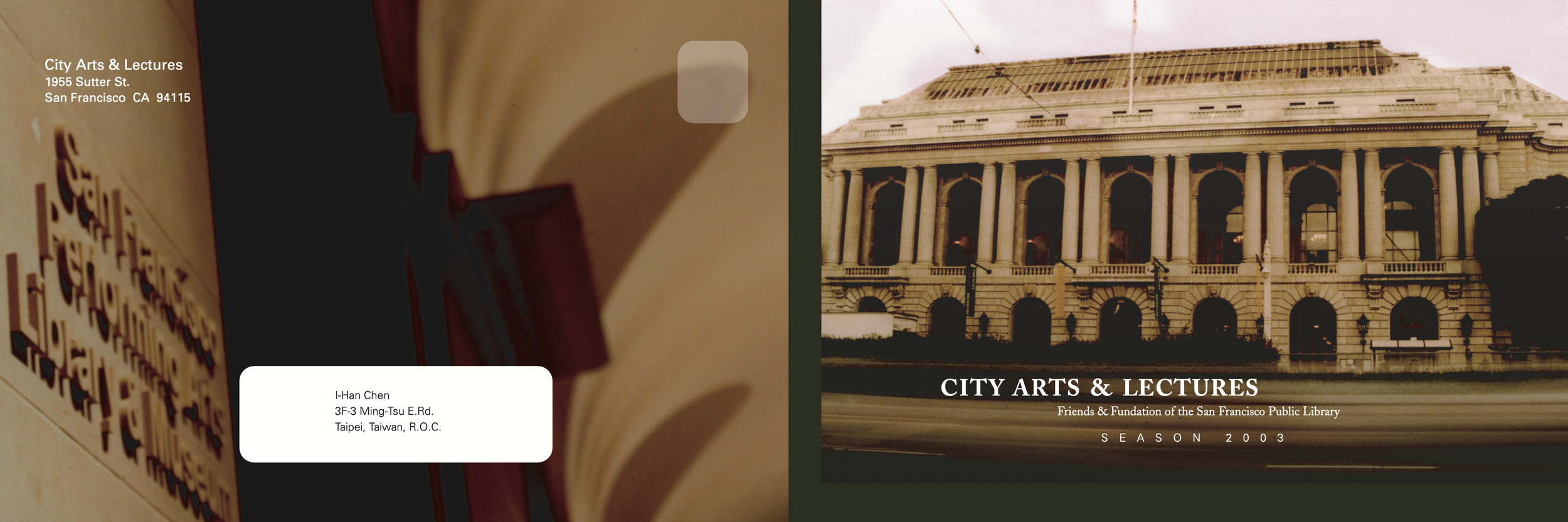
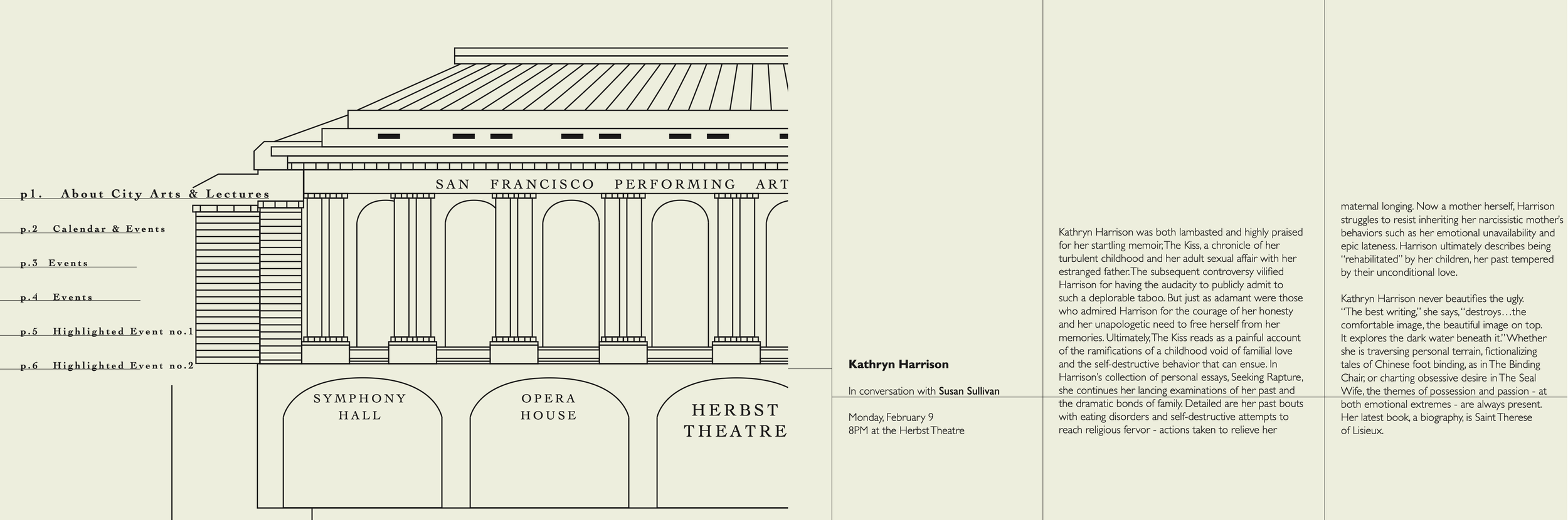
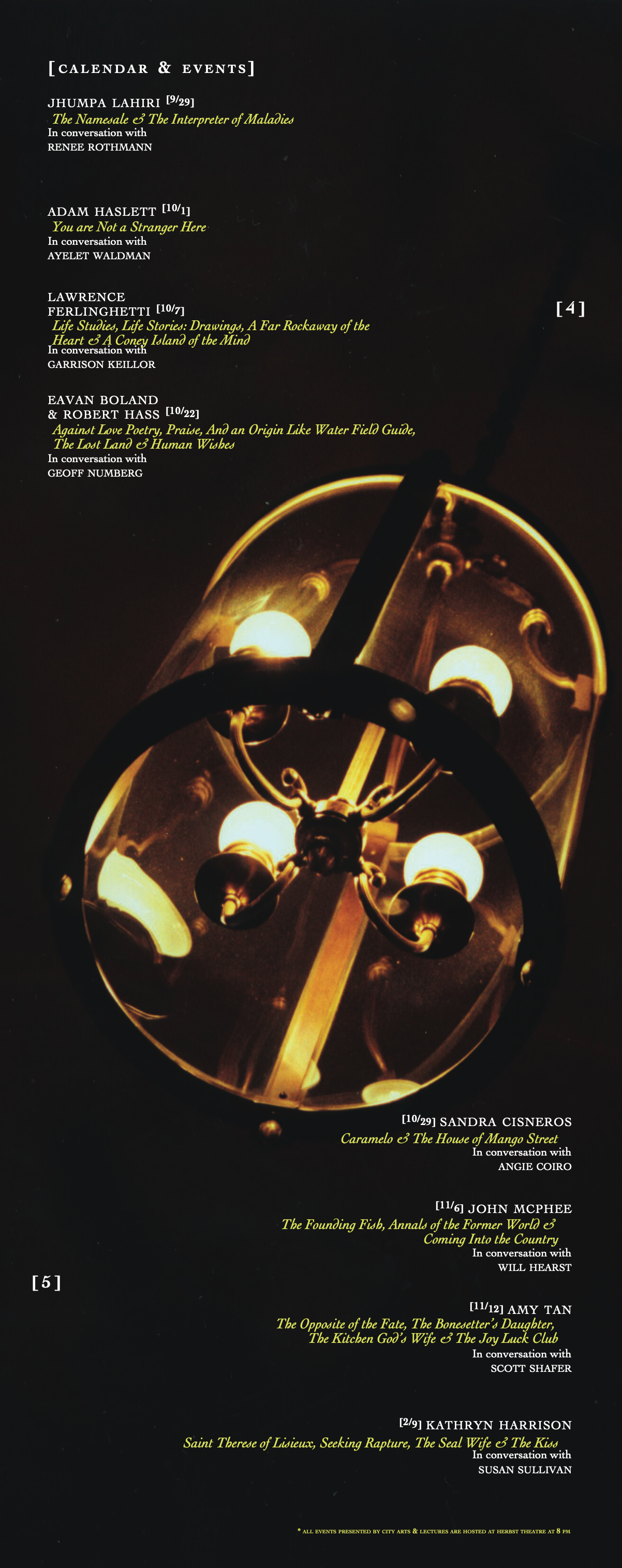
San Francisco City Arts & Lectures Program Brochure
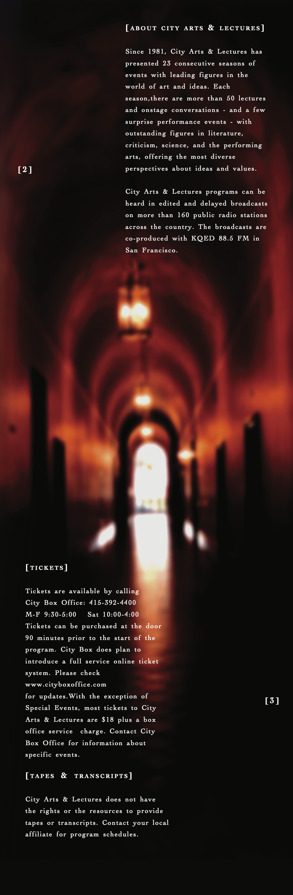
Since 1980, City Arts & Lectures has brought San Francisco audiences live onstage conversations, lectures, and occasional performances featuring some of the world's most compelling thinkers, writers, artists, scientists, and cultural figures.
The organization is located in the heart of San Francisco's Civic Center Historic District, a district born from San Francisco's post-1906 earthquake rebuild. This elegant Spanish Revival architecture, first opened in 1917, evolved into a vibrant public performing arts venue in 1952.
For this programming brochure, the goal was to let the building tell its own story—highlighting that thread of resilience from post-earthquake ambition to international cultural significance and contemporary revival. As the designer, I captured the theater's timeless beauty through my own photographs and illustrations, weaving its history into the visual narrative to evoke the enduring spirit of place and purpose that makes every City Arts & Lectures event feel both intimate and iconic.
Book 002 / Hornall Anderson Design Works
Hornall Anderson Design Works was a pioneering, award-winning design and branding firm based in Seattle, Washington, renowned for its innovative, multi-disciplinary approach to creating meaningful brand experiences for iconic clients across industries.
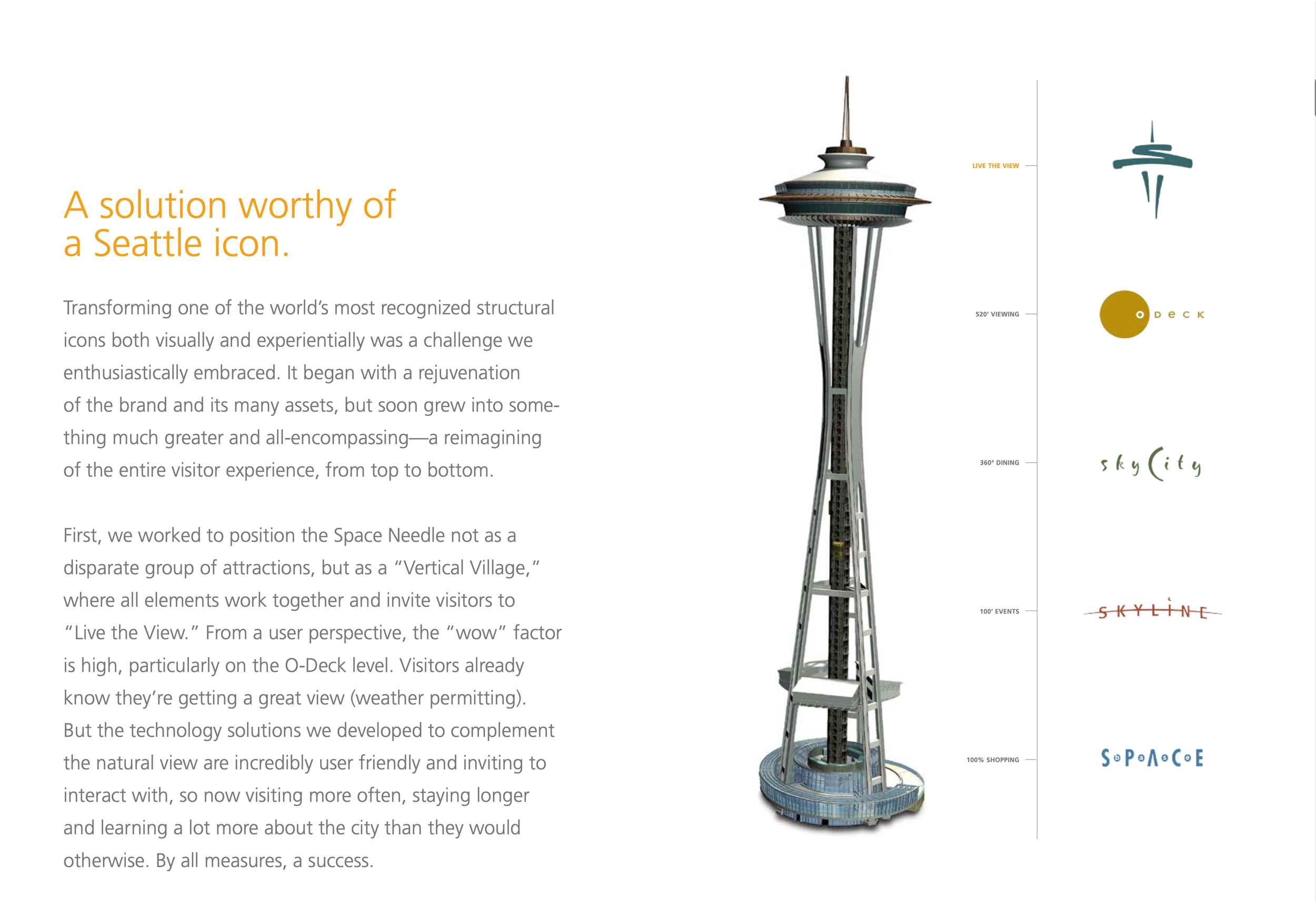
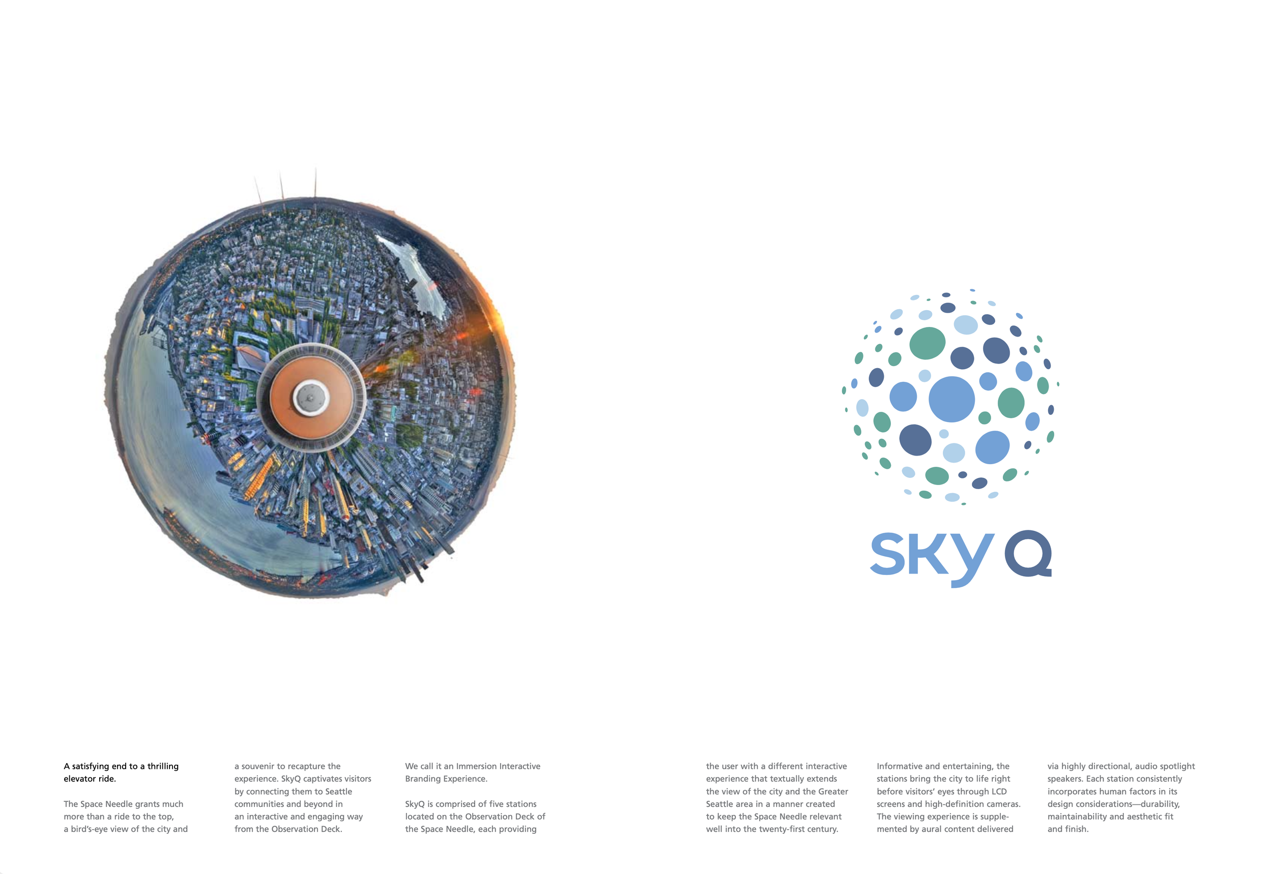
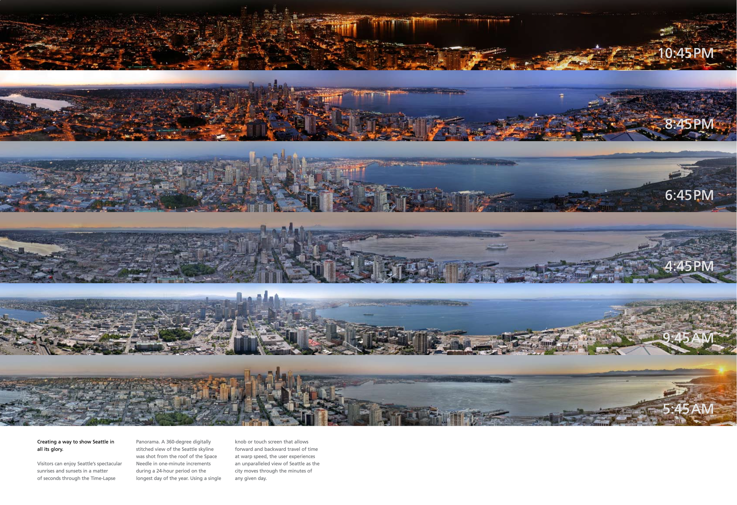
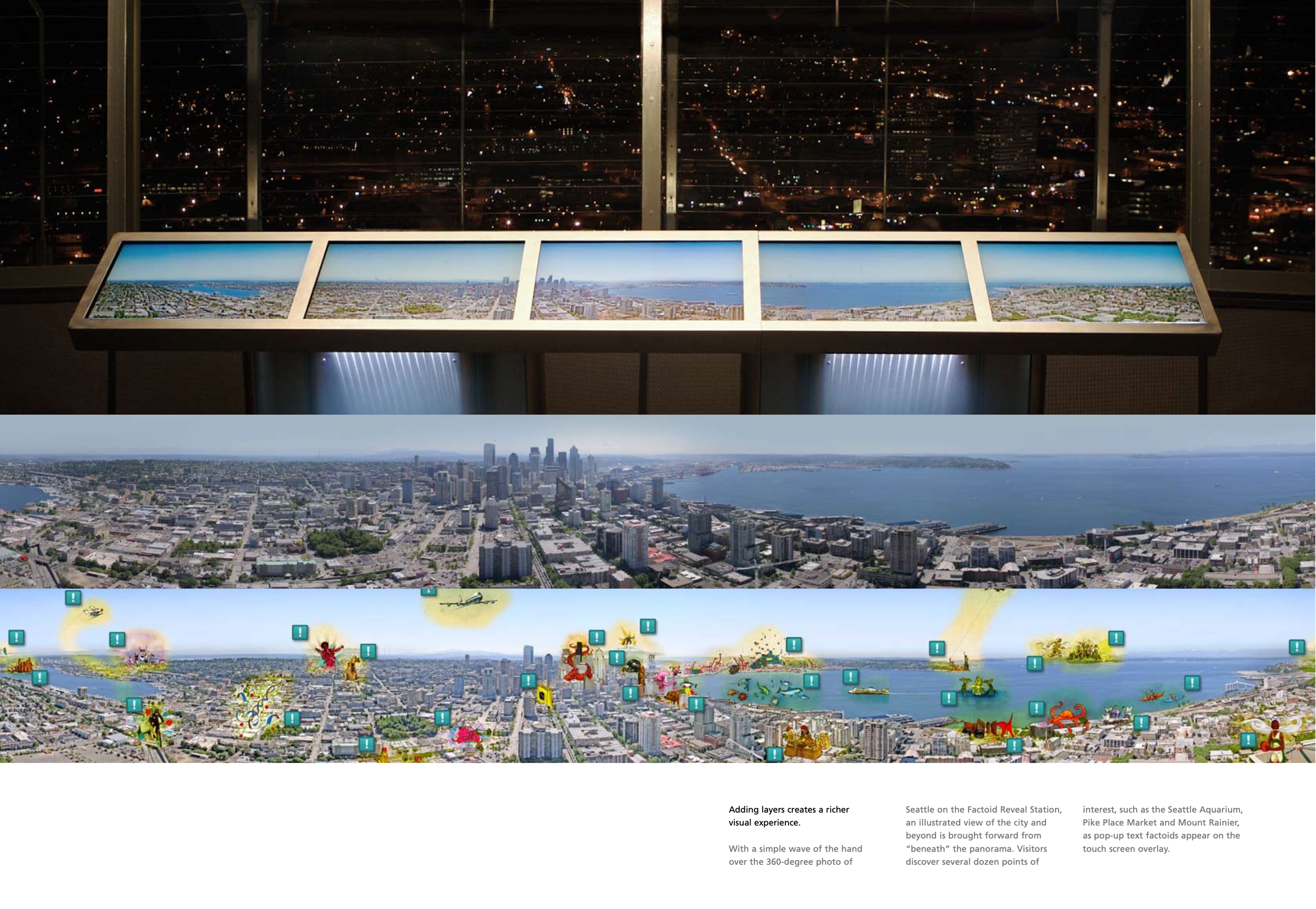
The Space Needle—Seattle's most recognizable landmark, built for the 1962 World's Fair—commissioned Hornall Anderson to reimagine its brand identity and visitor experience. This project involved refreshing the visual language, voice, and expression of the icon to better capture the Space Needle’s enduring spirit of wonder, innovation, and connection to the Pacific Northwest.
Seattle Space Needle
This promotional brochure was created to celebrate and showcase the successful launch of that rebrand. As a key contributor to the piece, I helped craft its design, incorporating photography and illustrations to highlight the new identity's impact, the collaborative process, and the enhanced visitor experience that followed. The goal was to let the reimagined brand story shine through—evoking the Space Needle's legacy of looking forward while staying rooted in Seattle's innovative heart
Book 003 / Celery Design Collaborative
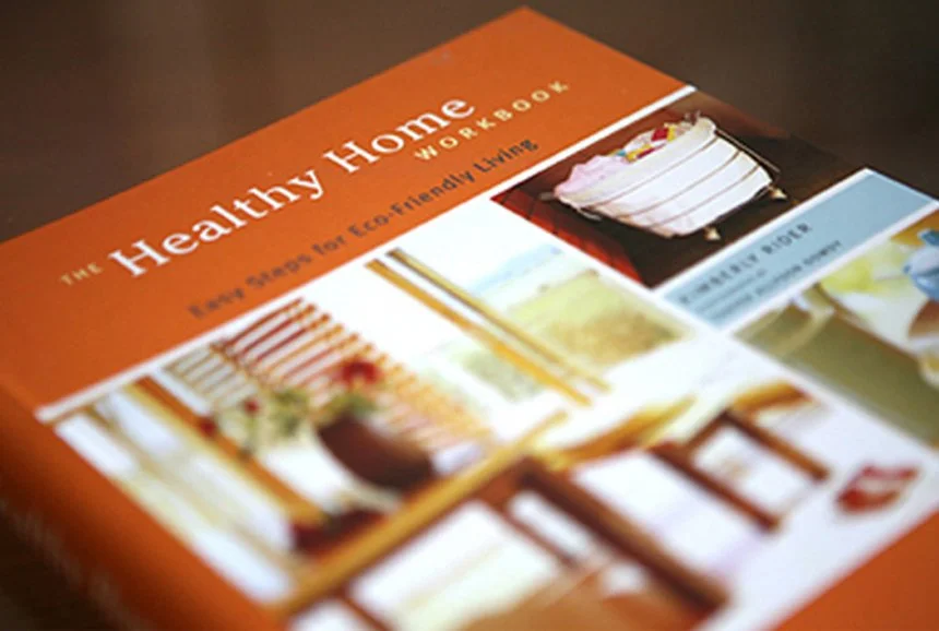
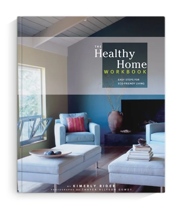
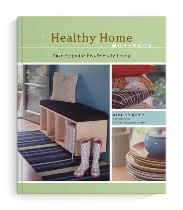
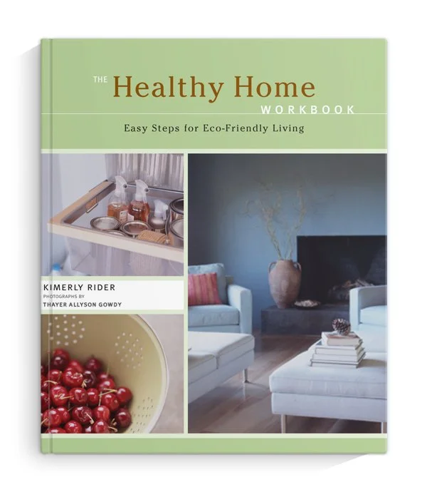
The Healthy Home Workbook was published by San Francisco Chronicle Books. Authored by interior designer Kimberly Rider, this practical, project-based guide empowers readers to create healthier, more eco-friendly living spaces without breaking the bank or sacrificing personal style.
As the designer of the book’s cover, I developed multiple layouts to capture the workbook’s approachable, empowering spirit. I explored various typography hierarchies, color palettes, and visual balances—ranging from a full-bleed airy example of a full living space to close-up projects that are easy and approachable—to make the cover feel welcoming, trustworthy, and immediately communicative of its core promise: healthy living can be beautiful, accessible, and stylish.
The final cover design reflects that empowering energy, inviting homeowners, renters, and design enthusiasts alike to open it and begin creating their own healthier homes.
The Healthy Home Workbook
Book 004 / CCAC
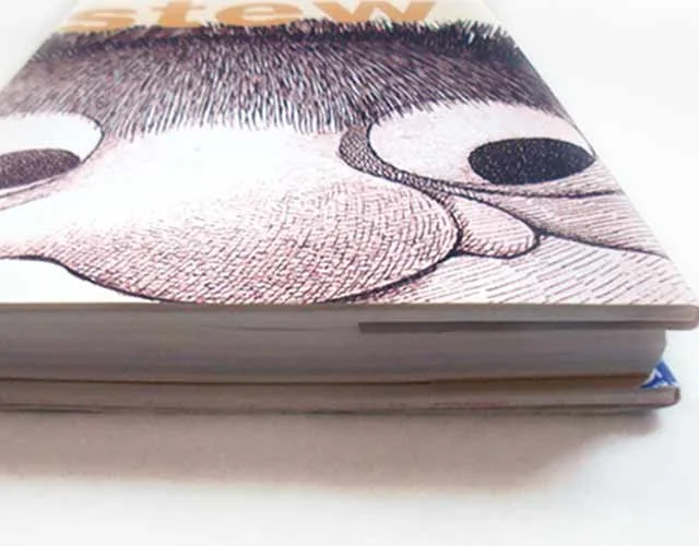
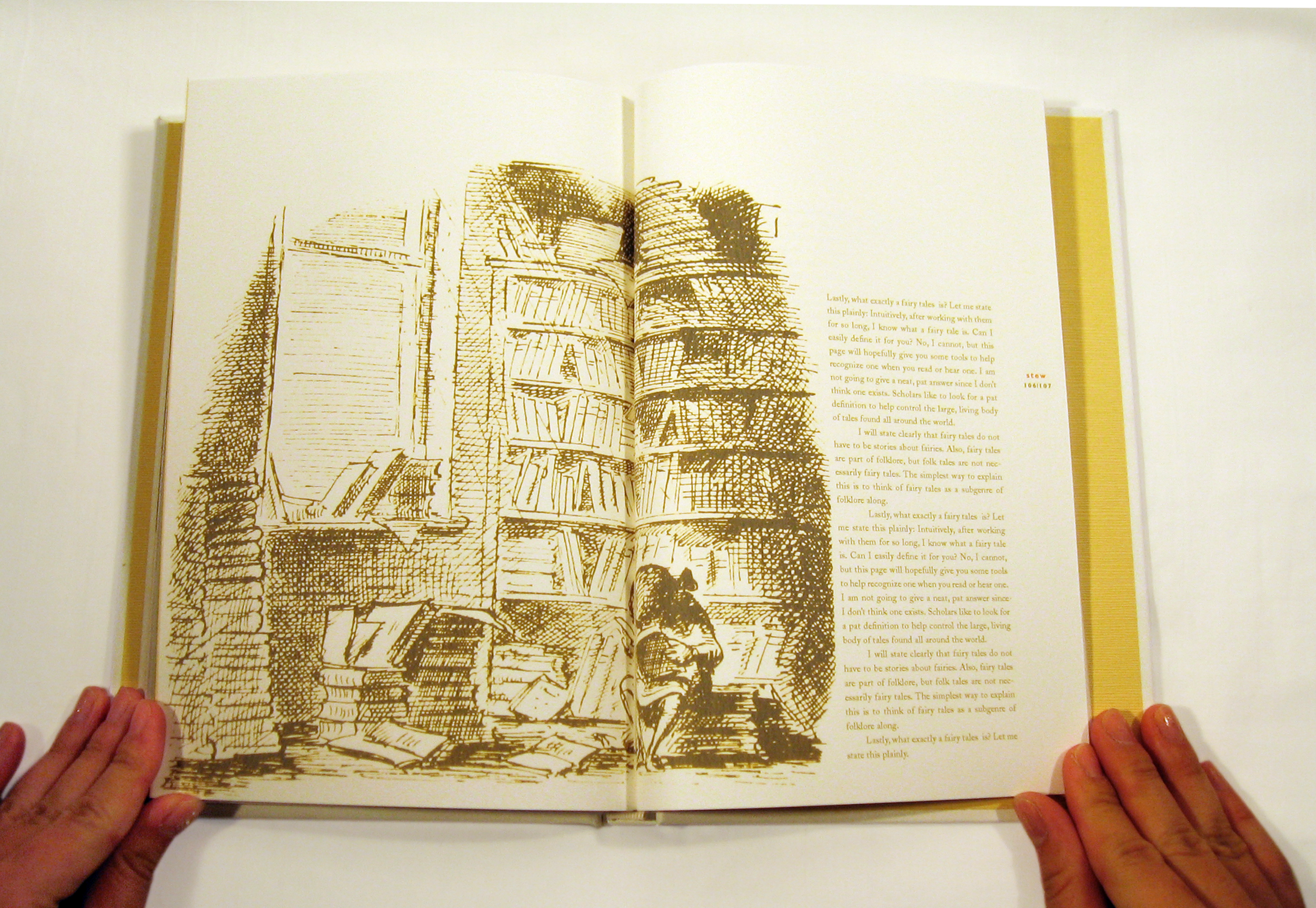
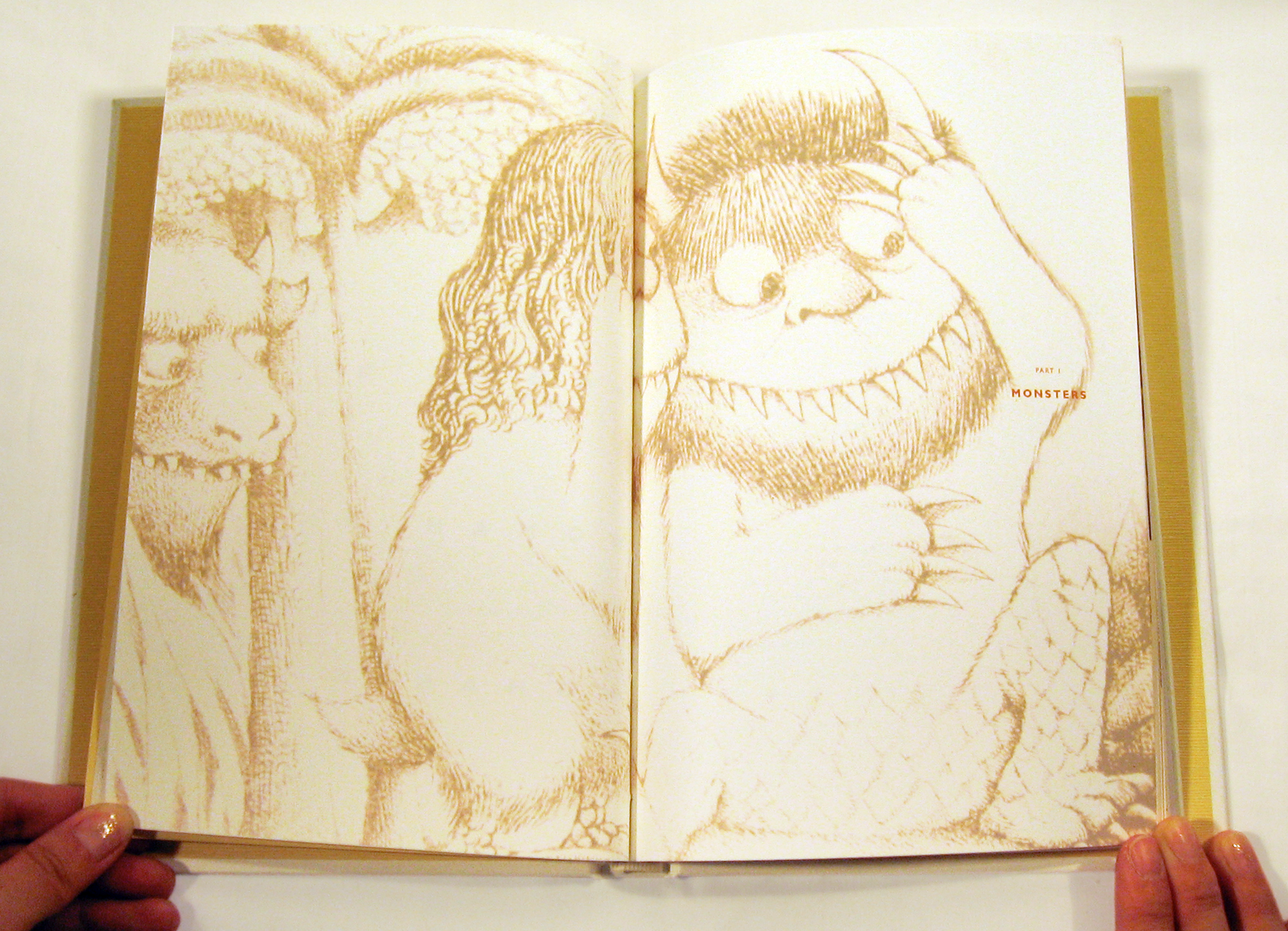
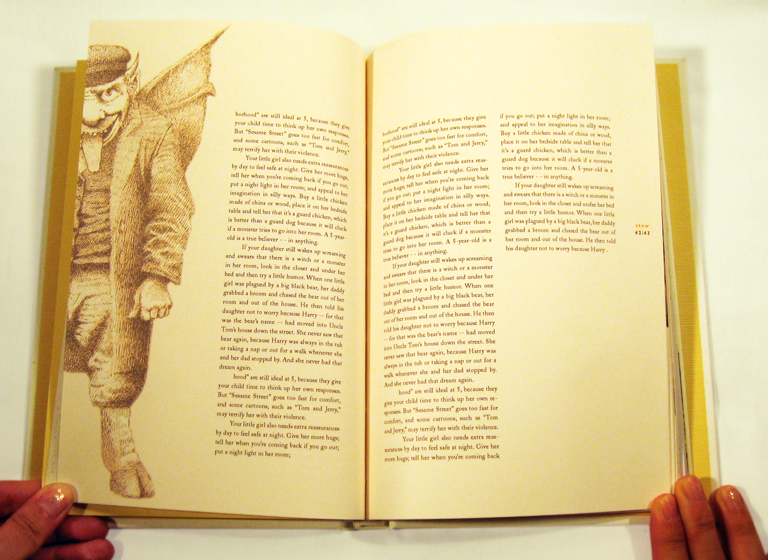
Stew: A Mixology of Monsters, Elves, and Faires
Stew is a captivating children's book that cleverly plays on dual meanings of its title. At its core, "Stew" evokes a simmering pot filled with a mysterious mix of ingredients—blending whimsical, mythical creatures into one deliciously intriguing brew. Yet it also challenges the classic adage "don't judge a book by its cover": the witch's infamous stew, long feared as being made from lost children, might just be a hearty garden vegetable medley after all. Through this playful ambiguity, the book invites young readers to question assumptions about monsters, fear, and the unknown—prompting them to wonder: Are these creatures truly evil, or simply misunderstood?
As the designer, I approached the book with a multi-dimensional vision to mirror its layered storytelling and thematic depth. The interior features color-coded pages as a chapter divide. The book jacket design is especially interactive and attention-grabbing: a mischievous monster peeks out from the bottom of the book. When unfolded, the book jacket transforms into a full-sized poster.
Each chapter is enriched with illustrations and narratives that explore the lore, origins, and personalities of these mythical figures. Beyond entertainment, the book encourages critical thinking—nudging readers to reconsider stereotypes and see nuance where fear once dominated.
Book 005 / CCAC
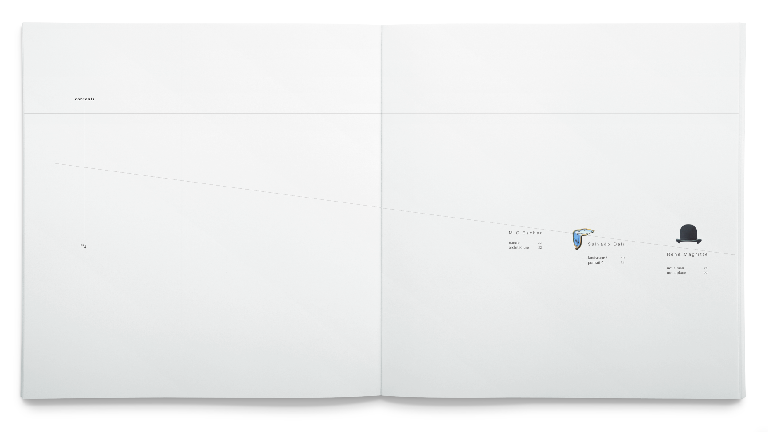
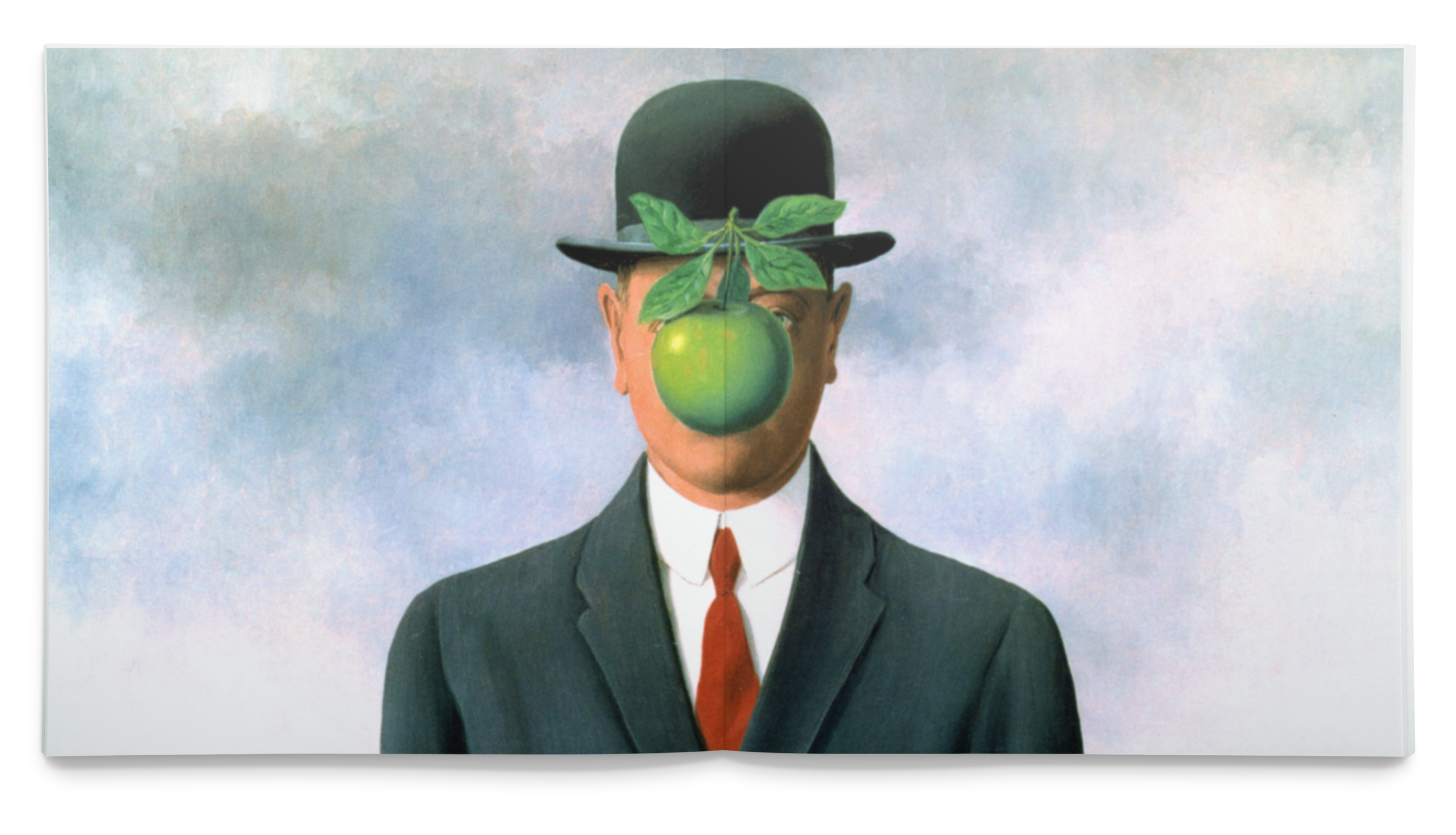
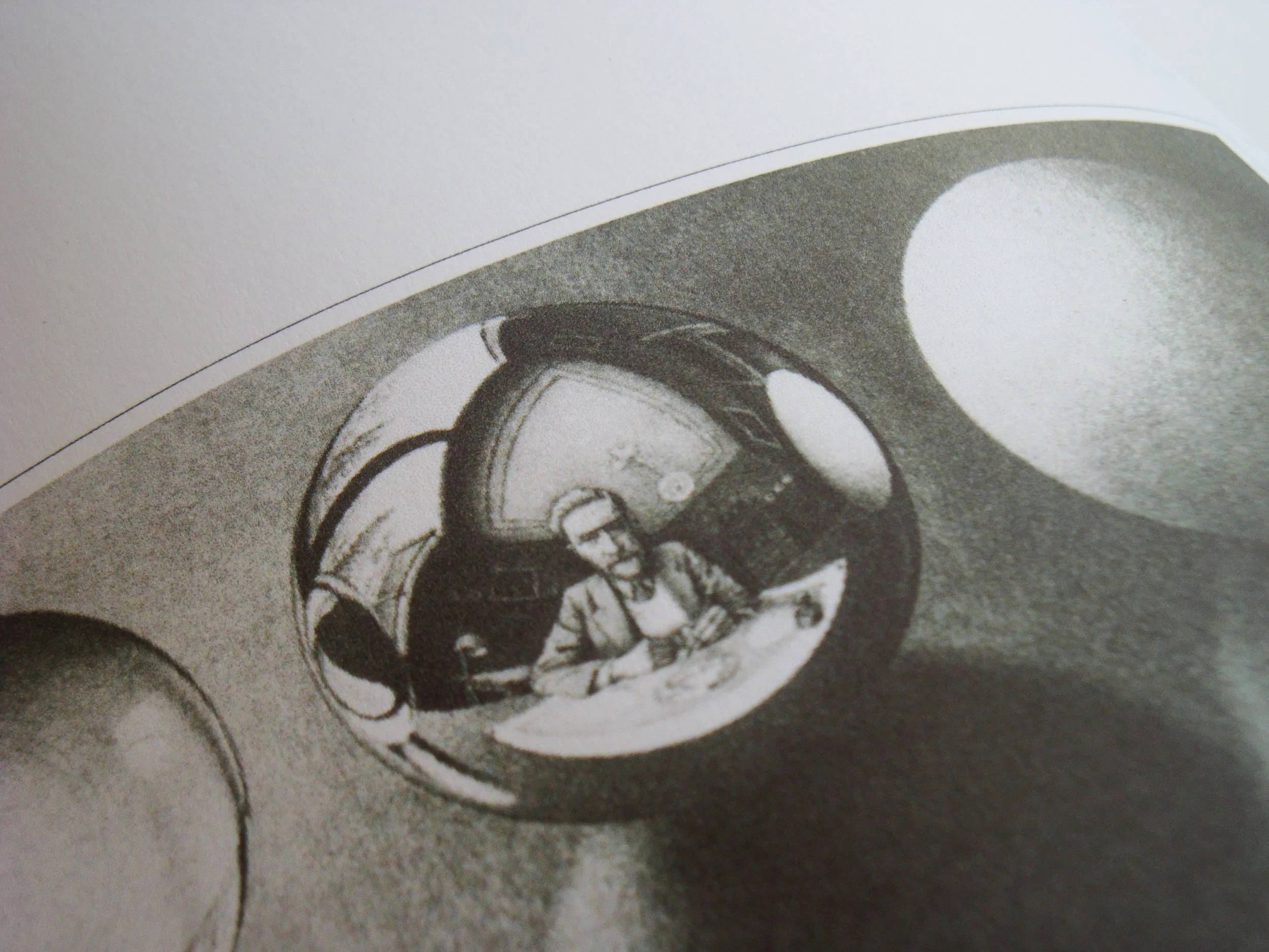
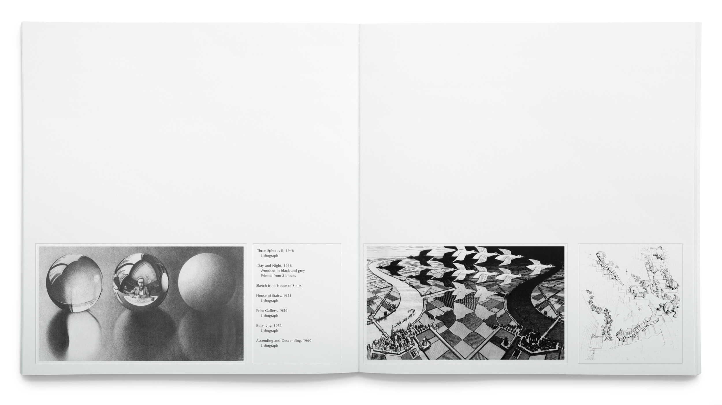
Illusion is a coffee table book that celebrates three iconic masters of illusion and surrealism in modern art: M.C. Escher, Salvador Dalí, and René Magritte.
M.C. Escher captivates us with his meticulously calculated, multi-dimensional works that draw viewers into mesmerizing puzzle-like worlds where logic bends, and reality unravels. Salvador Dalí, with his eccentric personality, infuses his paintings with nightmarish narratives, immerses audiences in a parallel universe, circus-like wonder of disorientation. Lastly, René Magritte, his juxtaposition of the bright and seemingly friendly subjects with the confrontational, paradoxical titles, forcing viewers to question the nature of reality, challenging perceptions with quiet, intellectual provocation.
Illusion
As the designer, I understand that the immersion of the three illusion artists’ artworks can be very captivating. So I created a visual language that is “spacey and guided.” Using the most basic graphic element, the line, I guide the viewer's gaze through the subtle lines weaving continuously throughout the volume—from the title page through the endpapers, linking chapter openers to folios, and connecting thumbnail snippets of artworks to their full-bleed, immersive reproductions.
The design invites readers on a smooth, almost hypnotic ride—gently ascending through the "valleys and hills" of each artist’s life story, historical context, and creative philosophy before arriving at the breathtaking full appreciation of their complete body of work. By threading these visual lines, the book mirrors the artists’ own illusions of continuity, impossibility, and revelation—transforming a static read into an experiential exploration that lingers long after the last page.


Book 006 / CCAC
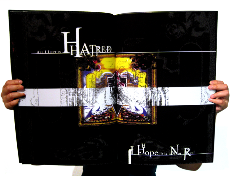
Torn is a haunting poetry coffee table book for the award-winning film Raise the Red Lantern. Set in 1920s China, a young, educated woman is forced into becoming the fourth concubine of a wealthy, traditional patriarch. Trapped in the opulent yet oppressive household, her efforts to breathe fresh air into centuries-old customs ultimately lead to her psychological and emotional unraveling, as the "demise evil" of the grand mansion consumes her body and soul.
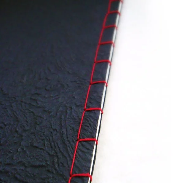
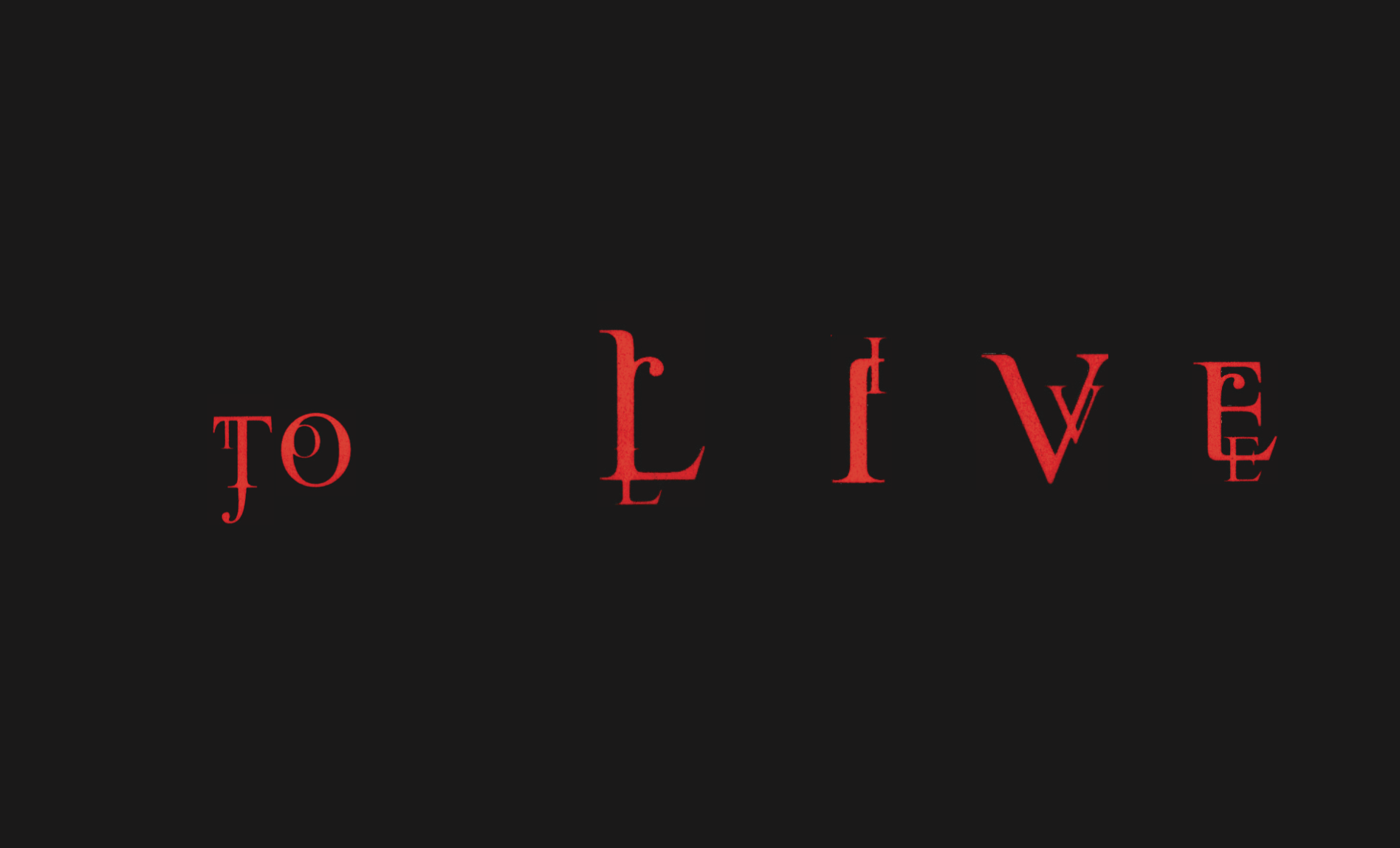
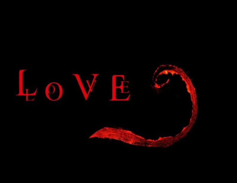
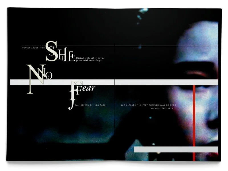
As the designer, I crafted the book to immerse readers from the very first moment in the film's overwhelming sense of doom and inescapable cultural nightmare—a suffocating force larger than any individual, swallowing them whole. The physical object itself becomes an embodiment of entrapment: an oversized format for imposing scale, a heavy debossed cover featuring intricate, oppressive motifs, bound with vivid red thread that evokes both the ceremonial lanterns and the blood of suppressed desire. The interior design amplifies this eerie weight—overlapping, fragmented typography that disrupts clarity, stark high-contrast elements against deep black backgrounds, and a palette dominated by crimson accents bleeding into shadow.
Every visual choice conveys the protagonist's trapped sadness and the broader emotional prison that tears anyone’s inner conflict. The book doesn't merely illustrate the story; it envelops the reader in its claustrophobic atmosphere, mirroring the main character’s descent and inviting reflection on her quiet horrors of confinement.
Torn